May 30, 2023
MAUP
Spatial
Mockup
We adopt a scrolly that uses animation to transition from maps to plots to explore how interactivity can be used to convey the Modifiable Areal Unit Problem (MAUP). This particular portofolio item can be reused to explore how the choice of spatial units can shape data interpretation, revealing detailed disparities, and emphasizing the necessity of understanding scale implications for better decision-making.

May 26, 2023
Spatial
Mockup
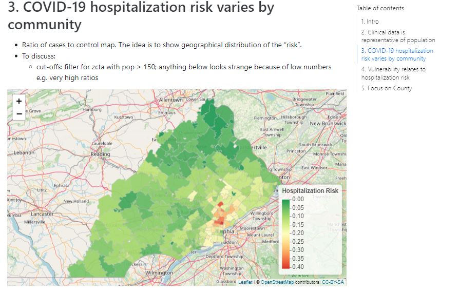
The study quantifies the impact of community factors, such as poverty and healthcare access, on the likelihood of developing severe COVID-19 requiring hospitalization, using community environment data from the Census and hospitalization records from HealthShare Exchange in the Philadelphia Region
May 22, 2023
Learning
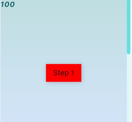
Basic scrolly utilizing @puddingViz Scrolly component step detection, tweened values for data transitions and basic outputs to show scrolling progress.
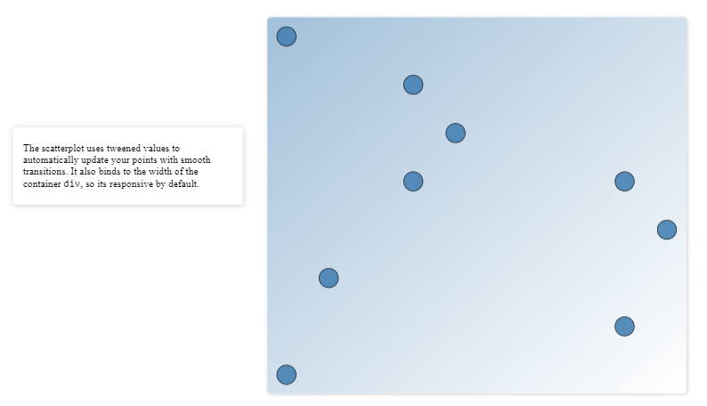
May 22, 2023
Scatter plot
Learning
Figuring out to how to tween a two dimensional data structure. This is a key component in developing tweened scatter plots.

May 22, 2023
Scatter plot
Learning
This is to adapt Connor's guide to a ChatGPT prompted scrolly. The goal is to learn put together a basic prompt and utilize the scrolly component, D3 scales and tweened values to create a scrolly that shows the effect of vaccination on a fictional disease. Note this is basic scrolly without best practices e.g. responsiveness.

May 21, 2023
@puddingViz
Scatter plot
Responsive
Reproduction of Connor Rothschild's (Moksha Data Studio)'s demo use case of Russel's <Scrolly/> svelte component; explaination can of code can be found here: https://www.connorrothschild.com/post/svelte-scrollytelling.